Arabi Facts Hub
is a nonprofit organization dedicated to research mis/disinformation in the Arabic content on the Internet and provide innovative solutions to detect and identify it.
Before You Believe the Numbers: A Practical Guide to Verifying and Understanding Statistics
Jul. 12, 2026 | AFH
ينشر هذا المقال التعليمي بالتعاون بين مجتمع التحقق العربي (AFH) والفنار للإعلام
Darrell Huff, the American author of "How to Lie with Statistics," highlights that a mathematically accurate figure doesn't guarantee a truthful message. Rather than blatant falsification, data is often manipulated through selective reporting or removal of context to mislead audiences. Critical analysis should therefore focus on the origin and presentation of a number rather than simply labeling it as incorrect.
Statistics permeate our daily lives via news outlets, social platforms, and research papers. We frequently see dramatic percentages, study findings stripped of their methodology, and stylized graphs designed for visual impact. To truly assess credibility, it is vital to look beyond the surface and investigate the context: identify who gathered the data, determine when it was collected, and understand the methods used.
Commonly presented as definitive facts, indicators like a "100% increase" or studies claiming the superiority of a particular group often mask a more intricate reality. For instance, a 100% rise could merely represent a change from one individual to two, and arithmetic averages often fail to reflect the economic situation of the majority. Furthermore, the design of a single graph can radically alter how data is perceived. Comprehensive fact-checking must extend beyond media like video and imagery to include a rigorous evaluation of the statistics used to bolster claims.
In his book "How to Lie with Statistics," American author Darrell Huff reminds us that a correct number does not necessarily mean that the interpretation or message is correct. Numbers can be used to mislead the reader by selecting specific figures or presenting them out of context, rather than by outright falsifying them. This means that criticism does not start by saying a number is "false," but by asking: Where did this number come from, and how was it presented?
We encounter numbers daily in news, social media, reports, and studies. Percentages are announced as dramatic figures, study results quoted without details, and graphs displayed in visually appealing ways. That is why seeing a number is not enough; we must ask about its context: Who collected the data? When? And in what way? This verification is essential to evaluating the credibility of the figure.
We might read, for example, that a percentage rose by 100%, that a study proved the superiority of one group over another, or that a graph shows a significant change in a certain indicator. We often treat these numbers as indisputable facts, while a deeper look might reveal that the story is more complex than it appears.
An increase of 100% might mean the number went from one person to only two, and average income may not reflect the reality of most individuals. Furthermore, a single graph can change our impression of the data depending on the way it was designed. Fact-checking is not limited to examining images, videos, and statements; it also includes understanding the numbers and statistics used to support various claims.
In this guide, we review the most prominent methods that might make numbers appear more convincing than they are, explain how to read statistics and graphs critically, and provide practical steps to help university students, journalists, and fact-checkers verify data before relying on it or republishing it.
Before you believe any number circulating on the internet, look for three common warning signs:
- A large percentage without mentioning the original number.
- A study or poll without clarifying the sample size.
- A number attributed to a "study" or "experts" without a link to the original source.
The presence of one of these signs does not mean the number is wrong, but it does mean you should verify it before citing or republishing it.
How can percentages be used in a misleading way?
Why might figures seem large even though the real change is limited?
Percentages are one of the most common ways of presenting data, but they can be misleading if presented without clarifying the original numbers. A percentage shows the magnitude of change, but it does not always tell us the magnitude of the phenomenon itself.
If a university announces that the number of students participating in a volunteer activity increased by 200%, the figure might seem large. But if the number of participants increased from only 10 students to 30, understanding the original numbers helps evaluate the magnitude of the change more accurately.
Medical institutions constantly clarify the importance of distinguishing between relative risk and absolute risk when reading study results. According to the U.S. National Cancer Institute, news might seem more exciting when it is said that a factor "doubled the risk" or "increased the risk by 100%," but understanding the true risk requires knowing the number of people actually affected. If the probability of infection rises from one in every 1,000 people to two in every 1,000, the risk has relatively doubled, but it is still low in terms of the actual number of cases. It is always advised to look at absolute numbers alongside percentages to understand the true magnitude of the impact.
When reading any percentage, always ask: an increase compared to what? And what is the original number? Often, understanding the base number is more important than knowing the rate of change itself.
Mean or Median? One number can change the whole story
When talking about income, prices, or salaries, we often see numbers presented as representing the "average." But this average does not always reflect the reality of most people.
Suppose we have five people whose monthly salaries are: 5,000, 6,000, 6,000, 7,000, and 100,000 pounds. If we calculate the arithmetic mean, it will be about 24,000 pounds, which is a number much higher than the income of four out of five people.
The median, which is the number that falls in the middle after arranging the values, would be 6,000 pounds. In this case, the median more accurately reflects the real situation of most members of the group.
For this reason, many statistical bodies, including the Office for National Statistics in the UK, recommend looking at the median when studying incomes and wages, because it is less affected by very high or very low values.
The use of the median is not limited to academics; official statistical agencies rely on it when analyzing wages and incomes. For example, the Australian Bureau of Statistics explains that the median is considered more representative of the "typical" employee's income because a limited number of people with very high incomes can raise the arithmetic mean in a way that does not reflect the situations of most workers. Relying on the mean alone may create a more optimistic picture than reality regarding income levels.
When you encounter a figure representing average income, prices, or spending, try to find out if the number is the arithmetic mean or the median, because choosing one of them may lead to a completely different impression of reality.
What about sample size?
Any opinion poll might seem convincing when its results are presented as percentages, but these percentages only gain meaning if we know the number of people surveyed.
If you read that "80% of students prefer online learning," it is useful to ask: how many students participated in the survey? Is it 50 students or 5,000?
The larger and more representative the sample is of the target group, the greater the ability of the results to reflect reality more accurately.
However, sample size alone is not enough to judge the quality of a study. A poll that included 1,000 people from one city cannot be considered representative of the opinion of all citizens of the country, even if the number seems large.
Verification is not limited to knowing the number of participants, but also includes knowing how they were selected. Were they selected randomly? And does the sample represent the different groups targeted by the study? A small sample may be more accurate than a larger sample if it is more representative of the society under study.
For this reason, many polling institutions publish additional information such as the margin of error and the method of selecting participants alongside the results themselves, so that the reader can evaluate the reliability of the presented conclusions.
Three statistical errors that recur in the news daily
Statistical problems are not limited to percentages or averages; there are other patterns of errors that constantly recur in news, reports, and social media posts.
The first of these errors is confusing correlation with causation, and we will return to it in more detail later.
The second error is statistical cherry-picking, which occurs when a part of the data that supports a certain conclusion is chosen while the rest of the data is ignored. A report might show the performance of an economic indicator during specific months that witnessed a noticeable improvement, while the data over years shows a different and more complex picture.
The third error is using absolute numbers instead of rates. Statistical and health institutions emphasize the importance of using rates when comparing between time periods or between different regions. An increase in the number of cases, deaths, or crimes does not necessarily mean that the risk has increased, as the population itself may have increased during the period under comparison. This is why many international health and statistical databases rely on infection or death rates per a specific number of people instead of raw numbers, because they allow for more accurate and fair comparisons between different societies and time periods.
Does correlation mean a causal relationship exists?
One of the most common errors in interpreting scientific studies is assuming that the existence of a relationship between two variables means that one of them caused the other. You might find a study suggesting that people who drink coffee frequently achieve better results at work, but this does not prove that coffee is the cause of better performance. The real cause might be another factor, such as the nature of jobs that require long working hours or differences in lifestyles among participants.
This problem appears a lot in media coverage of health studies. Headlines might be published such as "Coffee reduces the risk of developing a certain disease" or "People who eat larger amounts of fruits and vegetables are in better health," even though the study might be observational and only reveals the existence of a correlation between two variables. When reading such results, it is important to check whether the study actually proves a causal relationship or merely shows the existence of a statistical correlation.
When looking at a figure or study, always try to:
- Distinguish between correlation and causation.
- Ensure that the presented data represents the full picture.
- Know if the numbers are presented as absolute numbers or comparable rates.
How do you get to the original source of the data?
A common mistake is relying on a number circulating in a post or in the news without knowing its first source. As information moves between multiple sources, the chances of losing part of its context or interpreting it inaccurately increase.
Start by searching for the source of the number mentioned in the news or post. Does it refer to a study? A government report? An international database? If the source is not clearly mentioned, this is a sign that calls for more caution.
Suppose you come across a post saying that "70% of young people get news from social media." Instead of reposting the number directly, try to search for the name of the study or the institution that conducted it. The search process often leads you to the original report that explains the date of the study, the method of data collection, and the number of participants.
In many cases, original data can be accessed through the websites of the institutions that produced it, such as government statistical agencies, international organizations, or universities and research centers. Many scientific studies also provide their data or methodology publicly, allowing it to be reviewed.
When reaching the original source, check the date of the data, the methodology used, the sample size if present, and whether the results relate to a specific time period or geographic area.
During the COVID-19 pandemic, many numbers spread that were quoted from studies without referring to the original study, which led to the circulation of contradictory conclusions about the results themselves.
How do you spot misleading graphs?
Graphs might seem like an easy way to understand data, but they are sometimes used in a way that leads to inaccurate impressions.
One of the most common methods is starting the number axis from a high value instead of zero. This sometimes appears in coverage of poll or election results, where the difference between two candidates might look very large in the graph if the vertical axis starts from 45 instead of zero, even though the real difference between them might not exceed a few percentage points. In this case, the data itself is not wrong, but the way it is presented may give the reader an exaggerated impression of the size of the difference.
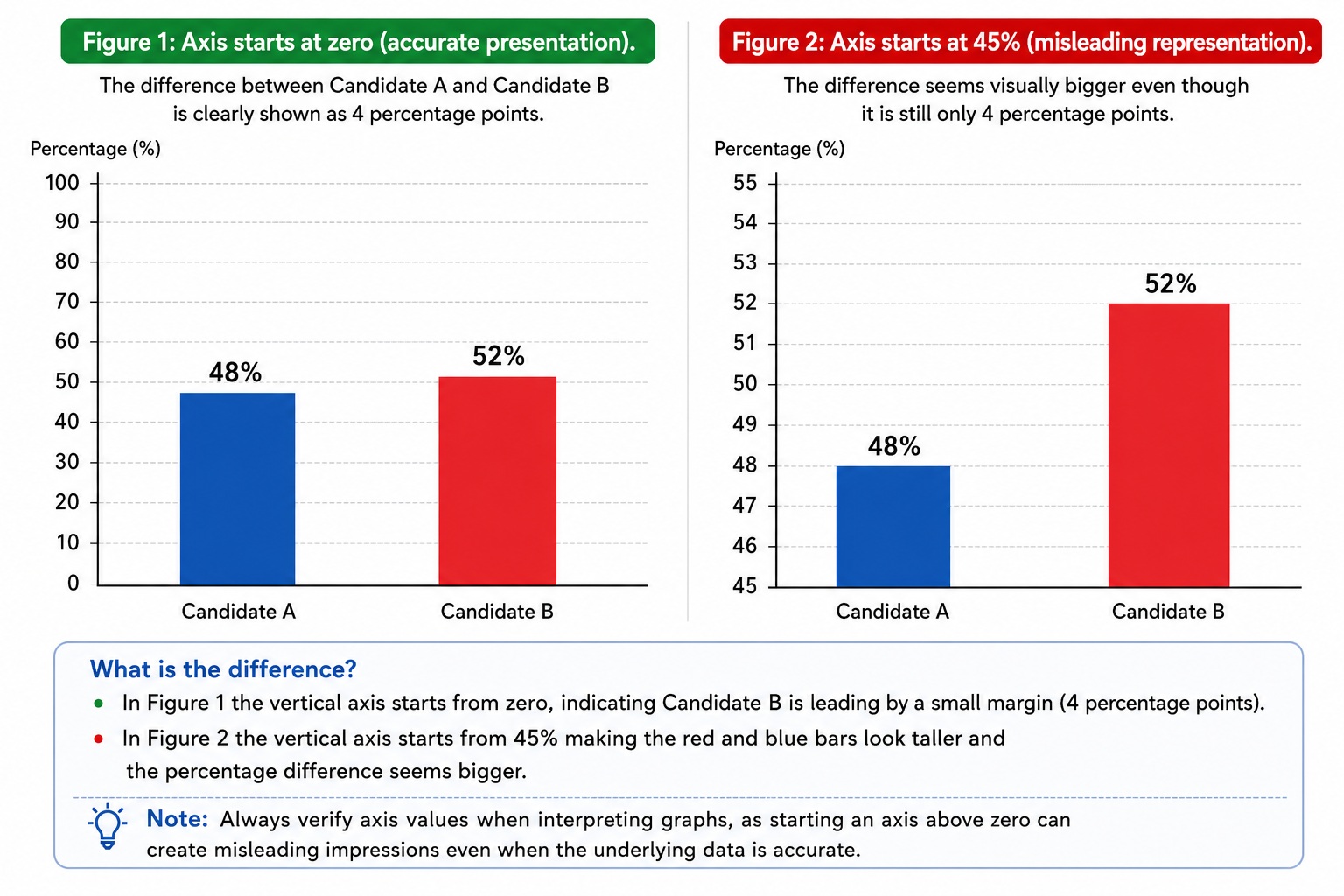
In this example, there is no problem with the data itself; candidate "B" is indeed leading over candidate "A" by a 4-percentage point difference. But if the vertical axis starts from 45% instead of zero, the difference might look visually much larger than its real size. This is why it is always advised to look at the axis values before interpreting any graph.
Likewise, exaggerated sizes or shapes might be used to attract attention, or a very short time period might be shown that suggests a certain trend while the data over a longer period shows a completely different picture.
Do not just look at the bars or lines, but examine the numbers written on the axes, check the time period displayed, and ask yourself whether the graph presents the full picture or only a part of it.
Before you republish any figures, follow these steps
You do not need to be a mathematician to verify statistical claims. Instead, effectively fact-checking data involves evaluating the presentation and context by asking several fundamental questions:
- Where did this number originate, and can the primary source be identified?
- Are percentages supported by the original raw figures?
- Is the figure provided an arithmetic mean or a median?
- When was this information gathered, and is it still relevant today?
- What was the scope of the data collection or the specific sample size?
- Do other independent entities validate these findings?
Beyond the raw numbers, the visual representation is equally critical. Avoid focusing solely on the visual rise or fall of bars and lines. To ensure a graph is complete and fair, meticulously inspect the axis values and the time intervals shown. Failure to do so may result in accepting a distorted or incomplete narrative.
- What is the original source of the number?
- Are there actual numbers alongside the percentage?
- Does the number represent an arithmetic mean or a median?
- When was the data collected? And is it still current?
- What is the sample size or the scope of the data?
- Does the graph display the data in a complete and fair way?
- Are there other independent sources that confirm the same result?
Numbers are important tools for understanding the world, but they are not immune to misuse. Dealing critically with statistics requires understanding the context in which a figure was produced and how it is presented. Before sharing any number or relying on it in a report, research, or post, it is useful to pause for a moment and ask some simple questions that might reveal a side of the story that cannot be discerned from the number alone.
Recent Educational Articles




Other Educational Articles